At Natural Pyrite UAE, we learned early that a premium product means nothing if the page selling it fails to convert. When we started applying HubSpot landing page best practices to our own pyrite jewelry and architectural décor collections, our results changed, more completed purchases, more qualified leads, and fewer visitors bouncing before they ever saw what we had to offer.
But here’s what we noticed: HubSpot hands you a robust set of tools, yet the platform alone doesn’t guarantee anything. The gap between a landing page that sits idle and one that consistently generates revenue comes down to structure, design, and optimization choices. Whether you’re showcasing handcrafted pyrite bracelets to executives in Dubai or promoting a B2B service to a global market, the conversion principles remain the same.
This guide covers 15 specific, tested best practices for building HubSpot landing pages that pull their weight, from headline hierarchy and form length to A/B testing, mobile responsiveness, and CTA placement. Every recommendation maps directly to HubSpot’s feature set, so you can implement without guesswork. By the time you finish reading, you’ll have a concrete playbook to turn underperforming pages into reliable conversion engines.
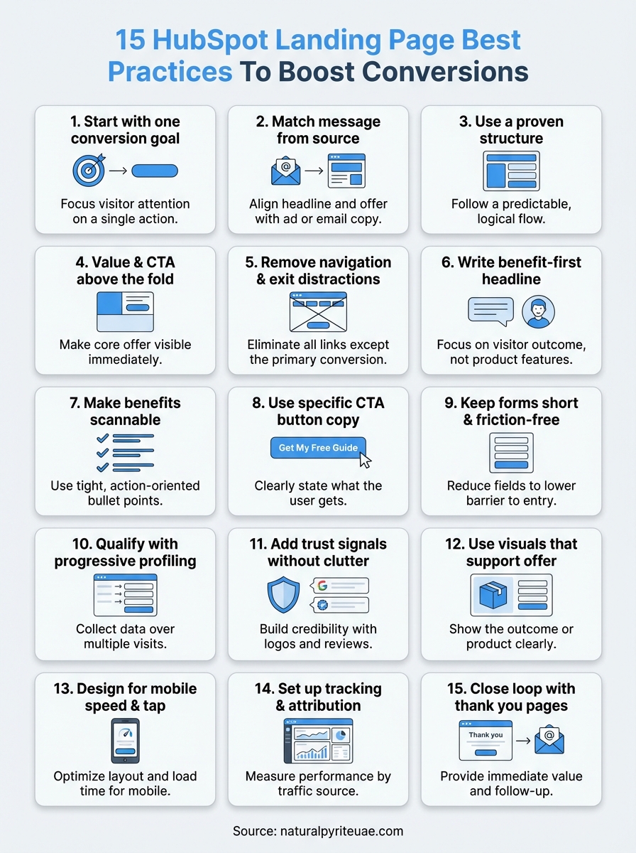
1. Start with one conversion goal
The single biggest mistake on landing pages is trying to accomplish too many things at once. When you give visitors multiple options, they face decision paralysis and often choose none of them. Every HubSpot landing page you build should have exactly one conversion goal, whether that’s downloading a guide, booking a demo, or completing a purchase. Defining that goal before you touch the editor is what separates pages that convert from pages that just look busy.
What to do in HubSpot
In HubSpot’s Landing Page editor, decide your single conversion goal before you place a single module. If your goal is form submission, remove any secondary CTAs linking to blog posts, product pages, or social profiles. Use HubSpot’s drag-and-drop builder to structure the entire page around that one action, making your form and primary CTA button the focal points of both the above-fold section and everything below it.
Write your conversion goal at the top of your page settings as the internal page name, something like "Goal: Free Consultation Booking." Every design choice you make after that should pass one question: does this element push the visitor toward that single goal, or does it pull them away from it? If the answer is the latter, remove it.
Why it boosts conversions
Every additional link or competing offer you add to a landing page increases cognitive load for your visitor. Decision-making research consistently shows that reducing the number of choices leads to higher completion rates. A page built around a single, clear action removes the mental effort of choosing, which shortens the path between arriving and converting.
The more choices you give a visitor, the less likely they are to choose the one that matters to you.
This principle sits at the foundation of solid HubSpot landing page best practices because the platform makes it easy to keep layering in modules, links, and secondary offers. The discipline isn’t in the tool, it’s in your commitment to one outcome per page.
How to test and measure it
Open HubSpot’s analytics tab on your landing page to track submission rate and view-to-contact ratio. If your submission rate sits below 20% for a gated offer, your page is likely splitting visitor attention across too many directions. Run an A/B test by cloning the page, stripping all secondary navigation and exit links from the variant, and measuring results over at least two weeks.
Track these three metrics to determine a clear winner:
- Submission rate: total form submissions divided by total page views
- Bounce rate: visitors who leave without any on-page interaction
- Time on page: a reliable signal of whether visitors are reading and engaging with your offer
2. Match the message from ad, email, or CTA
Message match is one of the most overlooked HubSpot landing page best practices, and it costs marketers conversions every day. When someone clicks your ad or email CTA, they arrive carrying a specific expectation. If your landing page headline, offer language, or visual tone differs from what they just saw, that disconnect creates friction and most visitors leave before converting.
What to do in HubSpot
In HubSpot’s Landing Page editor, mirror the exact headline or offer language from your source ad, email, or CTA button. If your email CTA reads "Get Your Free Pyrite Styling Guide," your landing page headline should repeat that phrase almost verbatim, not reinterpret it. Use HubSpot’s smart content feature to serve personalized headlines based on traffic source, so paid visitors see copy tailored to their ad while organic visitors see a variation that fits their context.
Why it boosts conversions
When your messaging is consistent across the entire click path, visitors feel instant confirmation that they landed in the right place. That sense of continuity reduces the cognitive friction that causes drop-off in the first three seconds. Visitors who click through from a specific promise are already pre-qualified and motivated, so a matched landing page converts that momentum rather than interrupting it.
Message mismatch is a silent conversion killer because visitors leave without telling you why.
How to test and measure it
Pull your traffic source breakdown inside HubSpot’s analytics panel and compare submission rates by source. If paid traffic converts significantly lower than email traffic, your ad-to-page message likely has a gap. Run an A/B test where you align the ad headline directly with the page headline in the variant, then track submission rate changes over 14 days.
3. Use a proven landing page structure
Guessing at page layout is one of the fastest ways to lose conversions you should have won. A proven structure gives your visitors a predictable reading path, keeps attention focused, and guides them naturally toward your CTA. Before you open HubSpot’s editor, knowing the skeleton of a high-converting page will save you hours of rework.

What to do in HubSpot
Build every landing page in HubSpot using this sequence of sections: a headline and subhead block, a value description or short body copy section, a benefits list, social proof or trust signals, and then your form or CTA module. HubSpot’s drag-and-drop editor lets you lock this sequence in a custom template so your team never starts from a blank canvas again. Save it as a reusable template inside the Design Manager so every new campaign inherits a structure that already works.
Why it boosts conversions
Visitors scan landing pages in an F-pattern, reading across the top and then moving down the left side. A structured layout that places your most critical information along that natural path reduces the effort it takes to understand your offer and take action. When the page flows logically from problem to solution to proof to action, you align with how visitors actually process information rather than fighting it.
A predictable page structure is one of the most underrated hubspot landing page best practices because it works before a single word is read.
How to test and measure it
Use HubSpot’s heatmap integration or a third-party behavior tracking tool connected via HubSpot’s tracking code to see where visitors stop scrolling. If drop-off happens before your form, restructure so your key value statement and CTA appear higher in the layout, then compare submission rates between the original and the revised version.
4. Put the value and CTA above the fold
Most visitors decide within seconds whether your page is worth their time. If they have to scroll to find your core offer or your primary CTA button, many of them won’t bother. Placing your value statement and call-to-action above the fold is one of the most direct HubSpot landing page best practices you can apply to close that gap immediately.
What to do in HubSpot
In HubSpot’s Landing Page editor, build your above-fold section using a two-column layout: your headline, subhead, and a short value sentence on one side, and your form or CTA button on the other. Keep the form to three fields or fewer if it sits above the fold. Use HubSpot’s section padding and spacing controls to ensure nothing forces a visitor to scroll before they see your offer and the action you want them to take.
Why it boosts conversions
Visitors who see your value and CTA without scrolling face less friction and make faster decisions. Research on web attention patterns shows that the highest engagement happens in the first visible screen, and anything below the fold receives significantly less attention. When your offer is immediately visible, motivated visitors can act right away without absorbing the entire page.
The fold isn’t a design preference; it’s where your conversion rate is won or lost.
How to test and measure it
Use HubSpot’s A/B testing tool to compare a version with your CTA above the fold against one where it appears lower. Track scroll depth and submission rate together to confirm whether moving the CTA up correlates with faster conversions and fewer drop-offs before the form.
5. Remove navigation and exit distractions
Every link on your landing page that does not lead to a form submission or CTA click is a potential exit route. Navigation menus, footer links, social media icons, and related blog post suggestions all give visitors a reason to wander away from your primary conversion goal. Removing them is one of the most impactful and underappreciated hubspot landing page best practices you can apply today.
What to do in HubSpot
In HubSpot’s Landing Page editor, go to the page settings and disable the header and footer from your active landing page template. HubSpot lets you create a distraction-free template inside the Design Manager that strips navigation entirely, so you can apply it to every campaign page without repeating this step each time. Remove social share buttons, sidebar widgets, and any footer links that redirect visitors away from the page before they convert.
Why it boosts conversions
When you remove every exit link except the CTA, you create a controlled environment where the visitor’s only meaningful option is to convert or close the tab. Studies on web behavior consistently show that reducing the number of clickable elements on a page increases the likelihood that visitors take the one action you want.
A landing page with navigation is a page with an escape hatch you built yourself.
How to test and measure it
Clone your current page in HubSpot and remove all header, footer, and secondary links from the variant. Run both versions using HubSpot’s A/B testing tool for at least two weeks and compare submission rates. If your variant outperforms the original, update your default landing page template to reflect the cleaner layout going forward.
6. Write a benefit-first headline and subhead
Most landing page headlines describe what a product or service is. That approach buries the reason a visitor should care. A benefit-first headline shifts the focus immediately to what the visitor gains, which is the difference between a page that earns attention and one that loses it in the first three seconds.

What to do in HubSpot
In HubSpot’s Landing Page editor, replace any headline that names your offer with one that states the outcome it delivers. If you offer a free consultation, don’t write "Free Consultation." Write "Book a Call and Walk Away with a Clear Growth Plan." Use your subhead to add a single supporting detail that handles the next logical question your visitor has. Keep both lines visible above the fold without requiring any scrolling.
Why it boosts conversions
Visitors arrive on your page asking one silent question: what’s in it for me? A benefit-first headline answers that question before they have to dig for it. This is one of the core hubspot landing page best practices because it aligns your page’s first impression with the visitor’s primary motivation, which shortens the gap between arriving and converting.
Your headline has roughly three seconds to earn a visitor’s decision to keep reading, so make those words work.
How to test and measure it
Use HubSpot’s A/B testing tool to pit your current feature-focused headline against a benefit-focused variant. Run both versions for a minimum of two weeks and compare submission rates and time on page. If the benefit-first variant outperforms the original, update your headline formula and apply it across your other active landing pages as a repeatable standard.
7. Make benefits scannable with tight bullets
Visitors don’t read landing pages, they scan them. If your benefits are buried inside long paragraphs, most people will miss them entirely before deciding the page isn’t worth their time. Tight, focused bullet points give your visitor a fast path to understanding your value without requiring them to work for it.
What to do in HubSpot
In HubSpot’s Landing Page editor, replace any multi-sentence benefit paragraphs with a bulleted list of five to seven items. Start each bullet with a strong action verb or outcome phrase and keep every line to a single idea. Avoid stacking two benefits into one bullet with "and." Here’s a working format you can use directly:
- Outcome: one-line description of what the visitor gains
- Speed or ease: one-line note on how quickly or simply they get it
- Proof point: one-line stat or specific claim that supports the benefit
Why it boosts conversions
Scannable bullets are one of the most practical hubspot landing page best practices because they match how visitors actually consume content under time pressure. When your key benefits are visible at a glance, visitors reach their decision faster and with less friction.
Visitors who understand your offer quickly are far more likely to act on it than visitors who have to work to figure it out.
How to test and measure it
Clone your page in HubSpot and replace your existing benefit copy with a tightly formatted bullet list in the variant. Run both versions using HubSpot’s A/B testing tool for at least two weeks, then compare submission rates and time on page. A drop in time on page combined with a rise in submissions confirms that visitors are scanning, deciding, and converting faster.
8. Use one primary CTA with specific button copy
Generic button copy like "Submit" or "Click Here" tells your visitor nothing about what happens next. Every CTA button on your landing page should answer the question "what do I get?" and make that answer impossible to miss. This is one of the most direct hubspot landing page best practices you can apply in under five minutes.
What to do in HubSpot
In HubSpot’s Landing Page editor, click your CTA button module and replace any vague copy with a phrase that names the specific outcome. Use formats like "Get My Free Guide," "Book My Strategy Call," or "Claim Your Discount Now." Keep the copy under five words where possible and limit your page to one primary CTA. If you have a secondary action lower on the page, style it as a text link rather than a button so your main CTA remains the dominant visual element.
Why it boosts conversions
Specific button copy removes the final moment of hesitation before a visitor clicks. When someone reads "Download the Pricing Sheet" instead of "Submit," they know exactly what they are agreeing to, which builds trust and reduces anxiety at the critical decision point.
Vague CTA copy creates doubt at the exact moment you need confidence from your visitor.
Visitors who feel clear about the next step convert at a higher rate than visitors who have to guess what happens after they click.
How to test and measure it
Clone your page in HubSpot and change only the button copy in the variant to a specific outcome-focused phrase. Run both versions using HubSpot’s A/B testing tool for two weeks and compare submission rates to find the phrase that converts best.
9. Keep forms short and friction-free
Every additional field you add to a form increases the effort a visitor must invest before converting. Most visitors weigh the value of your offer against the work required to claim it, and long forms tip that balance in the wrong direction. Keeping your form short is one of the core hubspot landing page best practices because it directly reduces the friction standing between a visitor and a completed submission.
What to do in HubSpot
Open HubSpot’s form editor and audit every field currently on your landing page form. For a top-of-funnel offer, limit your form to two or three fields: first name, email address, and one qualifying field if your campaign requires it. Remove any fields that serve internal reporting needs but add no value for the visitor completing the form. Use HubSpot’s field dependency settings to hide optional fields by default and only surface them based on answers the visitor provides.
Why it boosts conversions
When someone sees a long form, their brain calculates the time and personal data required before they ever reach the submit button. A shorter form signals lower commitment, which lowers the psychological barrier to starting. Research consistently shows that reducing form fields from five or more down to three or fewer produces measurable improvements in submission rates without reducing lead quality for most offer types.
The fastest way to lose a motivated visitor is to make them feel like they are filling out a job application to claim a free resource.
How to test and measure it
Clone your current page in HubSpot and remove one or two fields from the form in the variant. Run both versions using HubSpot’s A/B testing tool for at least two weeks, then compare submission rates across both versions to confirm whether the shorter form converts at a higher rate.
10. Qualify leads with progressive profiling
Progressive profiling lets you collect more information from returning visitors without making your form longer for first-time visitors. Instead of asking ten questions upfront, you ask two or three per visit and build a complete lead profile over time. Applying this as part of your hubspot landing page best practices keeps your initial form short while giving your sales team the context they need to prioritize and personalize outreach.
What to do in HubSpot
HubSpot’s progressive profiling feature is available directly inside the form editor. Enable it by selecting "Progressively profile your contacts" on any individual field, then add the additional questions you want to ask returning contacts. On a visitor’s second or third conversion, HubSpot automatically replaces already-answered fields with new questions, so your form stays the same length but collects richer data with every submission.
Why it boosts conversions
Progressive profiling solves a real tension in lead generation: the more you ask upfront, the fewer people complete your form. By spreading questions across multiple visits, you respect the visitor’s time on the first interaction while still gathering the qualifying data your sales process requires. Your form stays short enough to convert cold traffic while your contact records grow more complete over time.
Asking for everything at once tells your visitor you value your data more than their time.
How to test and measure it
Track your contact enrichment rate inside HubSpot’s contact records to see how many leads provide two or more rounds of form data. If enrichment is low, review whether your returning visitor offers are compelling enough to bring people back to a second gated page. Compare submission rates on progressive forms against static long forms to confirm the conversion lift this approach delivers.
11. Add trust signals without clutter
Trust signals reduce the doubt that keeps motivated visitors from submitting your form. The challenge is placing them strategically without turning your page into a cluttered wall of logos and testimonials that distracts from your primary conversion goal.
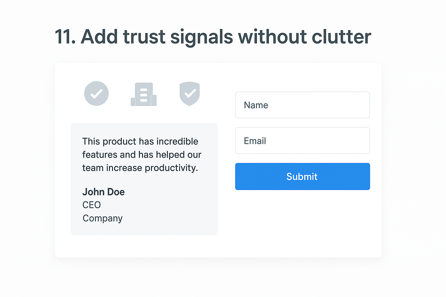
What to do in HubSpot
In HubSpot’s Landing Page editor, add trust signals in the section directly below your above-fold CTA. Use a clean row module for client logos or certification badges, and place one or two short testimonials near your form to address last-minute hesitation. Keep each testimonial to two or three sentences and include the person’s name, title, and company to make it verifiable. HubSpot’s rich text and image modules give you the layout control to keep these elements visually compact without sacrificing their impact.
Why it boosts conversions
Visitors arrive on your page with skepticism, especially when they haven’t encountered your brand before. Social proof and credibility markers answer that skepticism at the exact moment it surfaces, right before someone decides whether to fill out your form. Applying this as part of your hubspot landing page best practices means you reduce doubt without adding visual noise that competes with your CTA.
Trust signals work best when they are specific and verifiable, not generic praise.
How to test and measure it
Clone your page in HubSpot and test one trust element at a time in your variant, such as adding a single testimonial near the form. Run both versions using HubSpot’s A/B testing tool for two weeks and compare submission rates. Track whether visitors who see the trust signals convert at a higher rate than those on the original version.
12. Use visuals that support the offer
Visuals shape how quickly a visitor understands your offer and whether they trust it enough to convert. A random stock photo or decorative banner adds nothing and can actually reduce credibility by making your page look generic. Every image, video, or graphic you place on a HubSpot landing page should make the value of your offer clearer or more believable.
What to do in HubSpot
In HubSpot’s Landing Page editor, replace any placeholder or stock images with visuals that directly represent the offer outcome. If you are promoting a downloadable guide, show a clean mockup of the guide cover as a visual anchor near your form. If you are offering a service consultation, use a real photo of your team or workspace rather than a staged corporate image. Keep every visual compressed and properly sized using HubSpot’s built-in image optimization settings to avoid slowing your page load time.
Why it boosts conversions
When visitors can see a tangible representation of what they are about to receive, the offer feels more real and more valuable. A well-placed product shot, guide mockup, or results-focused graphic removes abstraction and turns your promise into something the visitor can picture owning or using. This is one of the most practical hubspot landing page best practices because it works on a psychological level before the visitor reads a single line of copy.
Visuals that show the outcome of your offer convert better than visuals that simply decorate the page.
How to test and measure it
Clone your page in HubSpot and swap your current visual for an offer-specific mockup or outcome image in the variant. Run both versions using HubSpot’s A/B testing tool for two weeks and compare submission rates to confirm which visual approach earns more conversions.
13. Design for mobile tap, scroll, and speed
More than half of your landing page traffic arrives on a mobile device, and visitors on phones have less patience than desktop users. If your page loads slowly, stacks elements awkwardly, or places CTA buttons where thumbs cannot easily reach them, you lose conversions before your offer gets a fair read. Mobile-first design is not a layer you add after building the desktop version; it is where your HubSpot landing page best practices decisions should begin.

What to do in HubSpot
HubSpot’s Landing Page editor includes a built-in mobile preview mode that shows you exactly how your layout renders on smaller screens. Use it during every build, not just at the final check. Apply these adjustments before publishing any campaign page:
- Set your CTA button to full width on mobile so it is easy to tap with a thumb
- Increase body copy font size to at least 16px in the section settings
- Compress every image through HubSpot’s built-in optimization tool
- Remove background videos above the fold, which add load time without conversion value
Why it boosts conversions
Mobile visitors make faster, more instinctive decisions than desktop users. When your page loads in under three seconds and your CTA fills the width of the screen, you remove the two biggest friction points that drive mobile bounce rates up.
A slow mobile page loses visitors before they see a single word of your offer.
How to test and measure it
Check your page performance score inside HubSpot’s page settings panel, which flags specific speed issues directly. Pull your mobile versus desktop submission rates from HubSpot’s analytics tab to confirm whether mobile is underperforming, then run an A/B test with a simplified mobile layout to measure the improvement.
14. Set up tracking, attribution, and reporting
Building a high-converting page is only half the work. If you are not tracking where your conversions come from and how each traffic source performs, you are making optimization decisions based on guesses rather than evidence. Tracking, attribution, and reporting are the infrastructure that turns every other hubspot landing page best practices strategy into something you can measure, repeat, and improve.
What to do in HubSpot
Inside HubSpot, go to your landing page settings and confirm your HubSpot tracking code is installed before publishing. Connect your page to a campaign inside the Campaigns tool so every conversion ties back to a specific initiative, whether that is a paid ad, an email sequence, or an organic push. Use HubSpot’s UTM parameter builder to tag every inbound link with source, medium, and campaign values so your attribution data stays clean from day one.
Why it boosts conversions
You cannot fix what you cannot see. When your attribution is set up correctly, you know which channels drive visitors who actually convert and which ones bring traffic that bounces without action. That visibility lets you shift budget, copy, and targeting toward what works and cut what doesn’t, which compounds your conversion rate improvements over time.
Clean attribution data is what separates marketers who iterate intelligently from those who repeat the same mistakes.
How to test and measure it
Open your HubSpot campaigns dashboard and review submission rate, contact rate, and revenue attribution by source each week. Compare performance across traffic channels to identify your highest-converting source, then prioritize that channel in your next campaign build. If two channels show similar traffic volume but very different submission rates, investigate the message match between those sources and your landing page to find the gap.
15. Close the loop with thank you pages and automation
Most marketers treat the thank you page as an afterthought, a simple confirmation screen that does nothing after the form submits. That is a missed opportunity. Your thank you page is the one moment when a visitor’s engagement and trust are at their highest, which makes it the best place to deepen the relationship and direct the next step.
What to do in HubSpot
In HubSpot’s Landing Page editor, build a dedicated thank you page instead of relying on a generic inline confirmation message. Include a clear acknowledgment of the offer they just claimed, a specific next step such as checking their inbox or booking a call, and a single secondary CTA that moves them further along your funnel.
Connect a HubSpot workflow to the form submission trigger so every new contact immediately receives a confirmation email with the promised resource and a short nurture sequence that follows over the next several days.
Why it boosts conversions
Closing the loop with automation is one of the most underused hubspot landing page best practices because it turns a one-time form fill into the start of a measurable relationship. When contacts receive immediate, relevant follow-up, they are far more likely to open future emails, engage with your brand, and eventually convert to paying customers.
A thank you page that does nothing after submission wastes the highest-intent moment in your entire funnel.
How to test and measure it
Track your thank you page click-through rate and your workflow email open rate inside HubSpot’s analytics panel. If your follow-up email open rate falls below 40%, test a more specific subject line that references the exact offer the contact just claimed, then compare open rates across both versions over a two-week window.
Next steps you can take this week
You now have a complete set of hubspot landing page best practices to act on, and the fastest way to see results is to start with the changes that require the least effort. Pick one underperforming page this week, remove your navigation, sharpen your headline to focus on the visitor’s outcome, and cut your form to three fields or fewer. Those three changes alone will show you measurable improvement before the week ends.
From there, set up your tracking and attribution inside HubSpot so every future test gives you clean data to build on. Apply progressive profiling to your highest-traffic offers and connect a workflow to every form submission so no new lead goes cold.
Building intentional, conversion-focused pages takes the same mindset as choosing purposeful, handcrafted pieces for your space. Every detail should serve a clear purpose, and nothing earns its place on the page unless it moves your visitor toward the single action that matters.